• Work
  • About
  • Resume

Made with lots of
dirty matchas and <3love

Taylor Torres ~ © 2026

Say hi!! ⸜(。˃ ᵕ ˂ )⸝♡

  • Email ↗
  • LinkedIn ↗ (opens in a new tab)
Home
  • ˖ ִֶָ🌚 Overview
  • Context
  • Problem
  • Early Explorations
  • Pivoting to Motion
  • Design Crit
  • Design Decisions
  • Converging
  • The Plan
  • Shipped & Up Next
  • Reflections
Home
  • ˖ ִֶָ🌚 Overview
  • Context
  • Problem
  • Early Explorations
  • Pivoting to Motion
  • Design Crit
  • Design Decisions
  • Converging
  • The Plan
  • Shipped & Up Next
  • Reflections
  • Internship
  • AI Prototyping
  • Shipped 2026

Making Drag Intuitive in Duolingo Stories

Role
Product Design Intern
Timeline
July - August2026 (6 weeks)
Team
1 Product Manager2 Software Engineers1 Designer (me!)1 Motion Designer
Skills
AI Prototyping (Claude Design & Code)Motion DesignInteraction DesignProduct Strategy

Impact

  • ↓Down 2.44%

    Total stories quit rate

  • 1.7M+

    Daily iOS learners reached

  • 50+

    Design iterations

Overview

Making a brand-new interaction feel obvious from the first try

During my second summer at Duolingo, I spent most of my internship redesigning how learners interact with Arrange the Story Beats, an exercise where many learners were getting stuck.

Over six weeks, I explored everything from layout changes to AI-prototyped motion, jammed with our design studio, and worked with PM and engineering to find the right balance of impact and effort.

The final design was approved at product review and is now live in the app, where it reduced the total Stories quit rate by 2.44%.

Context

Arrange the Beats (ATSB) checks narrative understanding

Duolingo Stories are short conversations between two characters that build reading and listening skills through embedded interactive exercises. Arrange the Story Beats (ATSB) is the final exercise in every story. It asks learners to drag three key events into order to test whether they understood the full story.

Stories flow

Problem

Learners expected to tap, not drag

ATSB was the first Duolingo language exercise to use drag. Every other exercise works by tapping, so that’s exactly what learners did. When nothing happened, many assumed they ran into a bug and quit.

Quits spiked on initial exposure and dropped once learners adapted, demonstrating that the issue was first-use friction. Previous experimental data showed that clarifying instructional copy wasn’t enough since text was largely ignored.

Total stories quit rate

+21% more quits than baseline

  • With ATSB
  • Baseline

quits spike at launch

gap narrows as learners adapt

April 14April 28

TL;DR: Learners are giving up :(

Line chart, April 14 to April 28. With ATSB, the total stories quit rate spiked at launch, about 21% above the baseline, then the gap narrowed as learners adapted.

How might we...

make dragging feel obvious without relying on explicit instruction?

Early Explorations

First, fixing an icon that sent the wrong signal

I swapped the hamburger icon, which learners could mistake for a tappable menu, for a 6-dot grip, as it more conventionally signals a “grab” interaction. I also moved it to the right side, where most people’s thumbs rest.

Before
After

Then, building on what learners already knew...

I explored widely in Figma, then turned the strongest ideas into quick prototypes in Claude Design so I could test what resonated and iterate fast. Here’s a snapshot of a few of them.

Adapting Duolingo Math drag interactions for language exercises

Numbered timeline
Connected table

Removing drag altogether and going back to tap

Numbered tap tokens
Tap arrows

Pivoting to Motion

But if we want learners to drag, why not just show them?

Each layout changed how the exercise looked, but none of them showed learners what to actually do. So I started exploring motion that demonstrates the gesture before learners even touch the tokens, and brought my two strongest ideas to crit.

Shuffle demo, V1

Tokens swap places on load to show that the order can change.

Idle wiggle, v1

Inspired by rearranging apps on an iPhone screen, the tokens jiggle as an idle nudge.

Crit

Motion was promising, but it didn’t feel quite right yet

Upon taking this V1 prototype to crit with both the shuffle demo and wiggle, both PMs and designers agreed that motion was the right direction. The execution just needed rethinking.
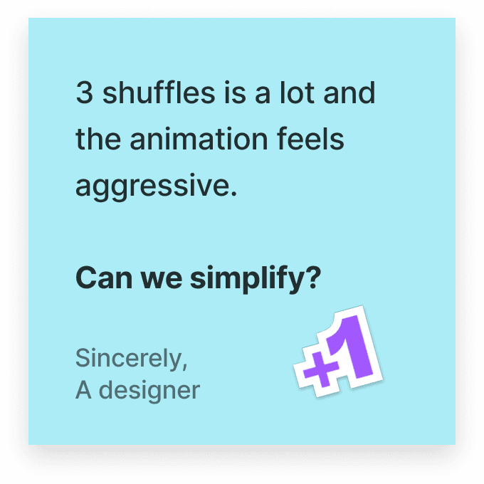
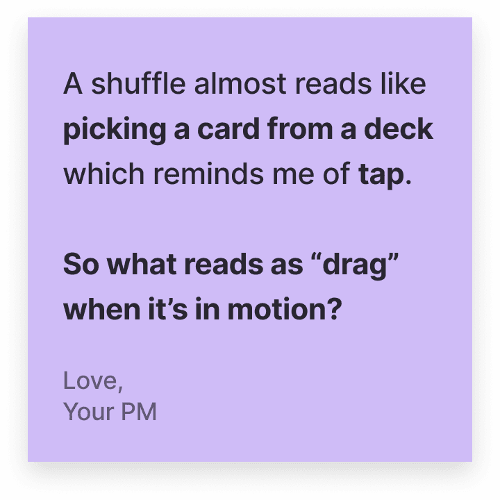
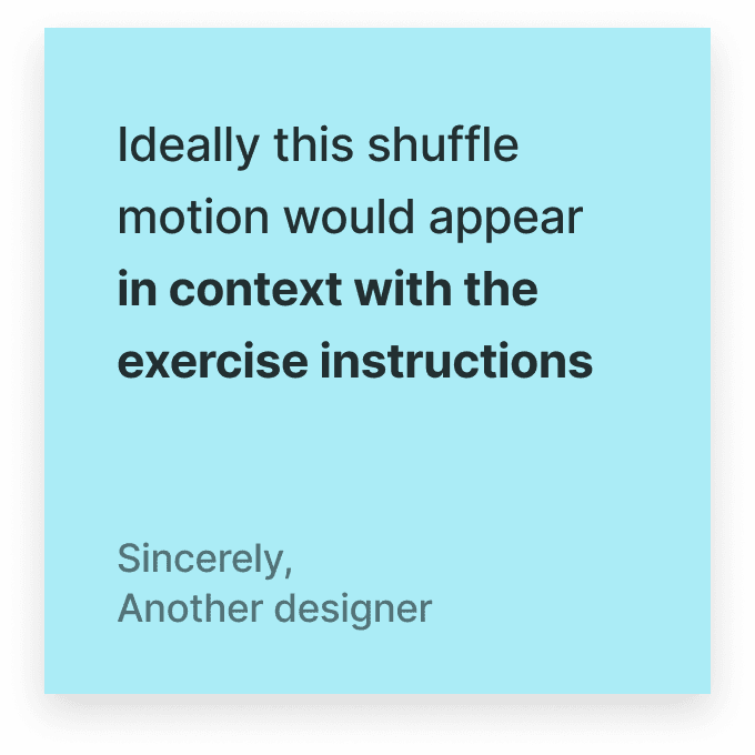
Shuffle & wiggle demo, V1
Sticky note: 3 shuffles is a lot and the animation feels aggressive. Can we simplify? Sincerely, a designer. Plus one.Sticky note: A shuffle almost reads like picking a card from a deck, which reminds me of tap. So what reads as drag when it’s in motion? Love, your PMSticky note: Ideally this shuffle motion would appear in context with the exercise instructions. Sincerely, another designer

Too much motion

Three shuffles felt overwhelming and slowed the exercise down. Learners needed a simpler cue.

Wrong signal

A shuffle could indicate a “pick” interaction, pushing learners toward tapping, which was the exact habit we were trying to break.

Key insight

Motion turned out to be more nuanced than I expected. I’d been focused on making the tokens move, when the real question was what that movement told learners to do.

The team encouraged me to keep pushing and to jam w/a motion designer ٩(^ᴗ^ )و ´-

Design Decisions

Sweating the small details

I set up a jam session with a motion designer from our design studio to work through the feedback. We talked through what makes movement intuitively register as dragging, like lift, overlap, and a sense of weight.

From there, I refined two directions, a shuffle demo and a tap nudge, to bring to a final stakeholder review, and I learned that even the smallest choices come with substantial tradeoffs.

Here are a few such decisions I thought through along the way.

Shuffle demo

How should tokens appear?

Altogether (chosen)
Individually

✓Chosen: Altogether

Tokens appear all at once, so learners don’t have to sit through an intro animation every time this exercise appears.

Shuffle demo

When should text populate?

Before shuffle
Mid shuffle (chosen)
After shuffle

✓Chosen: Mid shuffle

Filling in text mid-shuffle keeps tokens from looking broken, without making the shuffle seem like a hint.

Tap nudge

What if learners keep tapping? How should the token react?

Mock pull (chosen)
Mock swap

✓Chosen: Mock pull

A subtle, bouncy pull shows the token can move, without feeling as aggressive as a full swap.

Tap nudge

How much motion does the pull need?

Straight up (chosen)
Shake, then up

✓Chosen: Straight up

One upward pull was enough to show the token can move, so we dropped the shake.

Converging

No consensus, so I went back to the root problem

I brought three directions to PM, engineering, and design studio leads, but...everyone had a different favorite. Engineering leaned toward the tap nudge, studio preferred the shuffle, and PM wanted to take all three to review. To break the tie, I went back to the problem itself.

Least motionMost motion
  • 1) Drag handle

    A six-dot grip that signals drag with no motion.

  • 2) Tap nudge

    Eng’s pick

    Bounces up when learners tap, pointing them to drag.

  • 3) Shuffle

    Studio’s pick

    Shows a drag demo before learners even try.

Reframing the problem

Learners already knew how to drag. What they needed wasn’t a lesson, but a clear visual cue.

The Plan

Start with the simplest fix, add motion only if needed

The drag handle gave learners exactly that cue, with the least engineering effort. So we planned all three as experiments, starting with the handle and adding motion only if the metrics called for it.

  1. Done: Phase 1: Drag handle

    A visual cue, no new motion

    Effort

    Shipped

  2. 2

    Phase 2: Tap nudge

    Motion only when learners tap

    Effort

    Next, if needed

  3. 3

    Phase 3: Shuffle

    A full demo on every load

    Effort

    Later

🚀 Shipped

Phase 1 approved at product review and live now! (ㅅ´ ˘ `)

Next, I presented Phase 1 of the design at product review with my PM, and it was approved to ship. I then worked with our engineer to build it, covering details like dark mode and new edge cases.

Since launching, the design has reduced the total Stories quit rate (our north star metric) by 2.44%.

↪ Dark mode demo

What’s next

Turning my motion explorations into a team resource

Even though the more elaborate motion directions didn’t make it to product review, I didn't want everything I’d learned to stay with me. So I built a page on Duolingo's internal prototyping hub where anyone at the company can try them out.

↪ Building hub demo

Final reflections ദ്ദി(˵ •̀ ᴗ - ˵ ) ✧

What I learned

  • Go into feedback with a point of view

    Early on, I’d bring work to crit and leave with more questions than answers. Coming in with a clear recommendation made the feedback sharper and my decisions easier to defend.

  • Step back when you lose your intuition

    After so many rounds of feedback from different stakeholders, I lost track of what felt right midway through. Going back to the core problem, a learner tapping and giving up, helped me find my footing again.

  • Be resourceful!

    I’d never designed UI motion before. Jamming with a motion designer, learning Figma Motion, and prototyping with AI got me up to speed fast, and showed me how much I can learn by simply reaching out to experts and trying new tools.
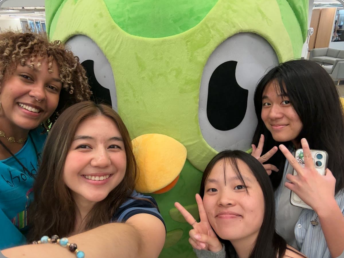
Four design interns taking a selfie with a giant green Duo owl mascot
design interns with da owl
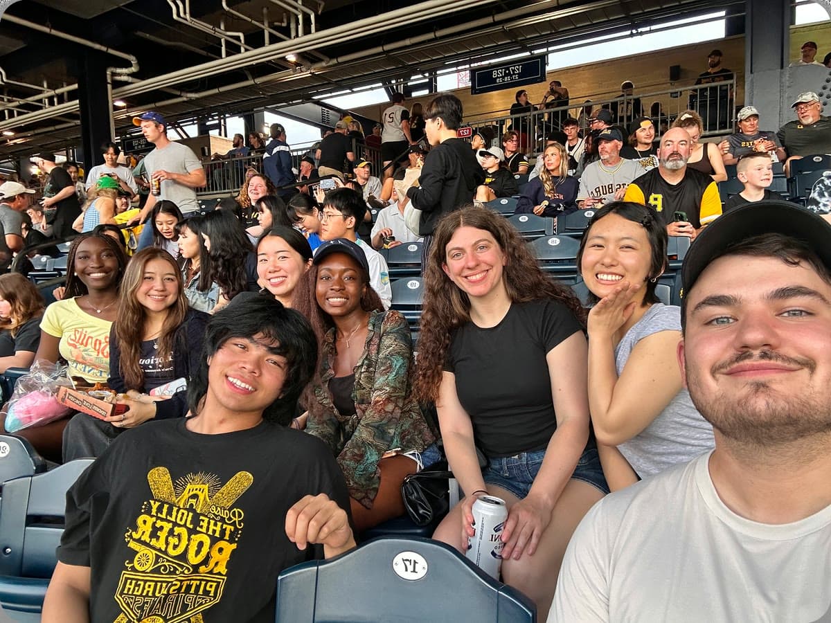
A group of interns smiling in the stands at a Pittsburgh Pirates baseball game
@ my first ever pirates game!

Next up

Bringing Duolingo Stories to life with props, at scale

Distilled 1,000+ scripts into a rules-based system, stress-tested on edge cases.

Read next→